|
|
Post by Kaza999 on Aug 7, 2011 10:08:11 GMT -8
Can anyone give me some tips on coloring, either digitally or with colored pencils? Colored pencils would be more helpful, because I only have Gimp for digital coloring. Here's some of my colored drawings (the first two are a few months older than the last one): I still kinda like this one. It's simple, and I don't think I did anything too horribly wrong. 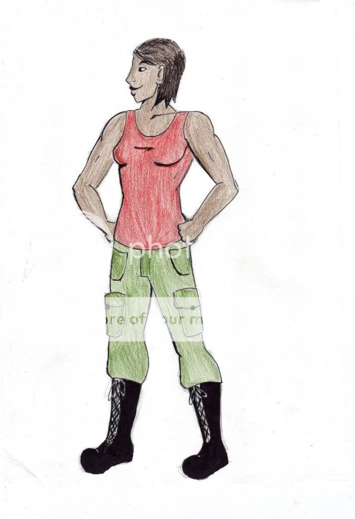 I used to like this one a lot more. Now I see all these problems with the painting and the font, and weird little technical problems, like the fact that her eyes are too small or that the coloring on her shirt is sketchier than it should be.  This one I like much better. It was mostly for practice. I was attempting to go for androgyny for both of them (a feat that's made harder by the shirtless one's shirtlessness), but I don't have much experience with that. 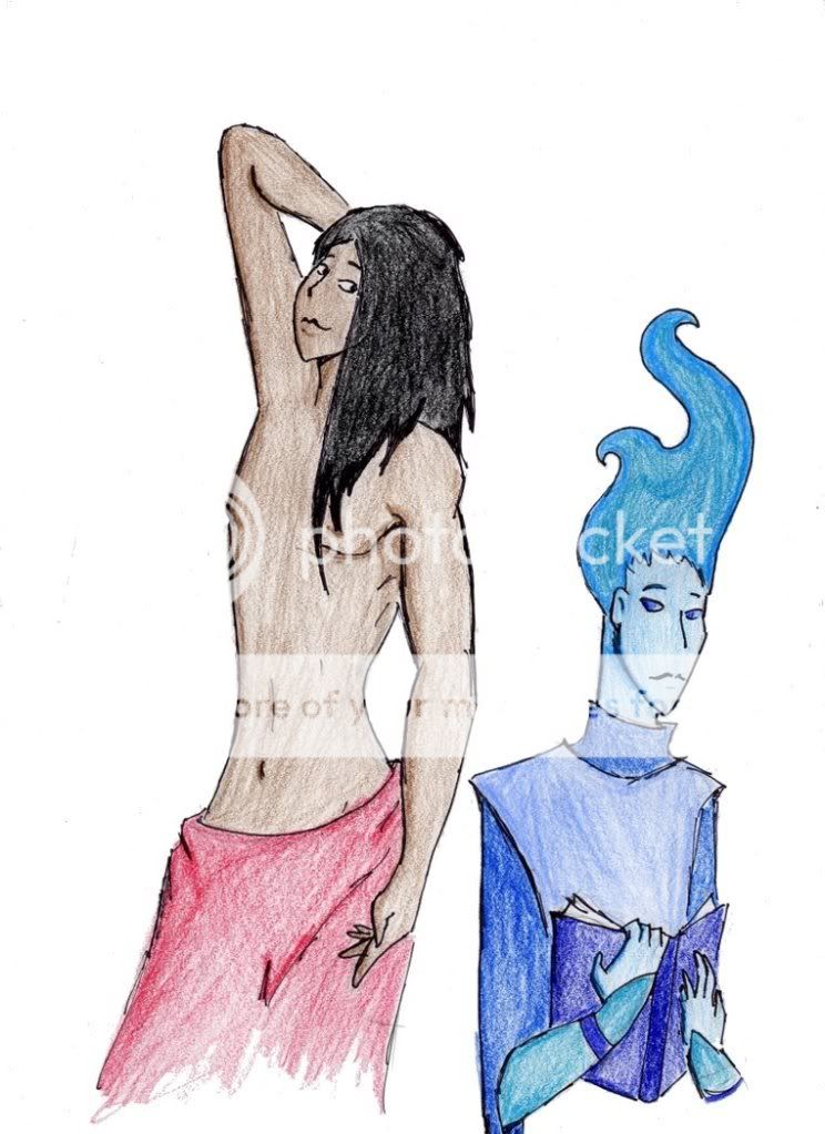 So...coloring? And possibly anatomy critique as well? |
|
Deleted
Deleted Member
Posts: 0
|
Post by Deleted on Aug 7, 2011 10:15:02 GMT -8
Can't see it on my computer.
|
|
|
|
Post by Kaza999 on Aug 7, 2011 10:22:33 GMT -8
Yeah, I just realized. I was fixing it but my browser crashed. Hold on a minute.
|
|
Deleted
Deleted Member
Posts: 0
|
Post by Deleted on Aug 7, 2011 15:31:55 GMT -8
Just my two cents. (More like twenty dollars.)
Well, for starters-when coloring a wide area, make sure to color in one direction (up and down, left to right, NEVER BOTH) so the coloring looks more even.
Next- what kind of colored pencils are you using? Make sure to press down on them, you'll get stronger colors(this is NOT if you're using Crayola-then only lulz will ensue and perhaps a broken pencil-stuff like Prismacolor works nicely.)
This isn't a part of coloring, but the lineart looks shaky(bros like me have spazzes for hands), so make sure you use clean, swift strokes and NEVER go over one place more than twice. The first picture's right leg looks like you made a mistake, THEN went back to ink over it.
If you want coloring tips, it is generally a good idea to introduce a light source to find out the different hues and shadows of one element(olive green can have other shades and hues beside olive green.)(Digital Programs are especially helpful in this, since you get to experiment with the settings.)
Try introducing different colors(think Color Theory and Impressionism) to a picture. An olive green shirt can have other colors in it besides olive green. It depends on the mood of the "Painting" you want to create. If it's a cold character, try introducing some cool colors(or vice versa with a fiery character). Cool colors range from dark red to purple, while warm colors range from Orange, Bright Red and Yellow(Green too, but that depends on the hue).
Another thing, before this tl;dr post is over: if you want to make a particular area stand out, introduce a brighter color(but be careful, some colors take a lot of skill to blend correctly).
Go get a color wheel. It'll help a lot.
|
|
|
|
Post by Kaza999 on Aug 7, 2011 19:24:08 GMT -8
Thank you for your advice, especially on the lineart, which I have a lot of trouble with.  Yeah, Prismacolor is best. Believe it or not, my coloring used to be worse than this because I would barely press down at all. I'm still really nervous about doing anything too dark, but I suppose I should darken things now because they're actually too light. |
|
xander
Persistent Member
 [Mo0:15]
Posts: 5,525
|
Post by xander on Aug 7, 2011 23:07:13 GMT -8
I don't have much advice because I fucking SUCK at coloring, but I'll say this: Don't want lines in your coloring? Color in small circles at an even pressure. It does wonders.
(At least, it did for me.)
|
|
Spacekat
Member
 Like a trolling stone[Mo0:0]
Posts: 413
|
Post by Spacekat on Aug 8, 2011 10:46:05 GMT -8
I can't color to save my life, but I can give some anatomy-related tips. In the first picture, the shape of the skull looks a little bit off to me. I don't know how to explain it, so I made this:  So, yeah, that's what bugs me about it. It kinda looks too flat. The two lines on the left are the original outline of the profile (blue) and the way I'd draw it (red), for a clearer comparison. Also, in the third image, the shirtless guy's torso looks a bit too long. I think it should be about one (or 2/3?) head shorter. Blue man's neck is also quite long, and the ear is too small. As a guideline, ears fall between the brow line and the line that marks the end of the nose. His arms are also quite strange, especially the right one. The proportion between the upper arm and the forearm seems to be the problem. |
|
|
|
Post by Kaza999 on Aug 9, 2011 11:04:23 GMT -8
Thanks, Xan, that actually sounds like some good advice. Yeah, I only noticed her exceedingly flat forehead after I'd started inking. I've always had problems with foreheads. I used to always draw receding foreheads until somebody pointed it out to me. That diagram is really helpful, though. Ears frustrate the hell out of me. I've only recently began to line the ear up properly with the nose and the eyebrow. I rushed Sunaas (blue guy) a lot, which is why s/he looks so much worse in comparison to Sakuum (no shirt guy), especially his/her arms. Thanks for pointing out the arms, though, I looked back at the picture and noticed the forearm is way shorter than the upper arm. Sakuum's head is also a bit too small for his/her torso, which is probably why the torso looks so long. |
|